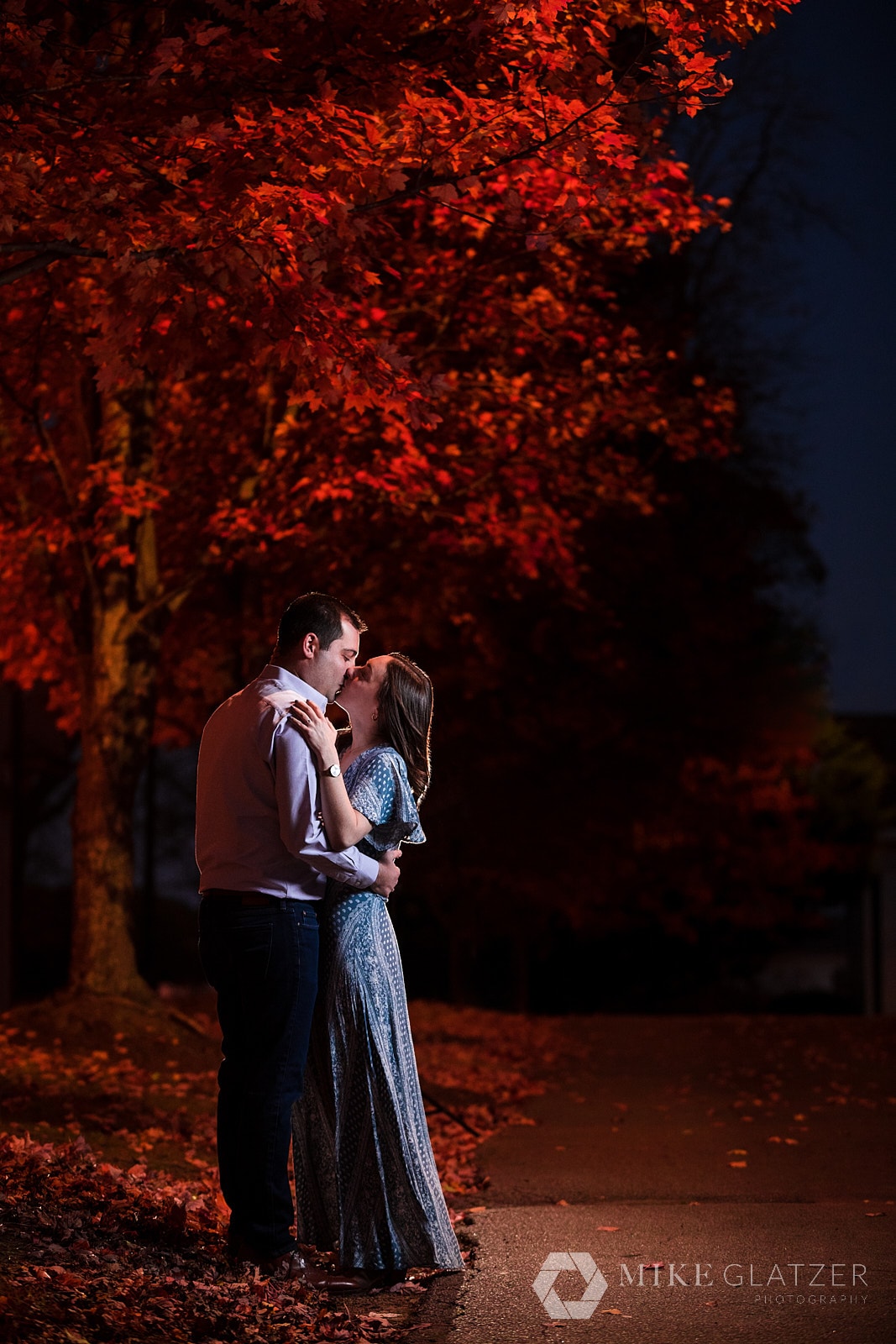
There’s an art to picking the best colors for photos. It’s like choosing the right colors for a room. Not only do you know it when you see it, but you can feel it. Harmonious color balance can induce specific emotion and change the perceived value of a thing. So, when you’re about to get some pictures taken, you’ll want to select colors to wear that make you look good but also raise the overall awesomeness of the picture itself. Below I’ve assembled how to choose the right colors for your skin undertones, a bunch of color schemes that go well together, colors to wear for seasonal portrait looks, and things to watch out for or avoid when selecting the best colors to wear for pictures.
Colors Have Meanings
As a result of evolution and societal development, people assign specific meanings to different colors. We do this unconsciously and automatically. Evolution told cavemen that brightly colored reptiles and fish were venomous or dangerous. Marketing agencies over the years taught us that purple was associated with luxury and majesty. Therefore, it’s important to select colors that fit your personality and the tone of the message you’re trying to convey in your pictures. Orange Theory fitness uses the color orange in its marketing and branding because it is associated with energy and is positive. So, if you go to one of their gyms, you expect an upbeat culture with energy to work out. Once you learn the common meanings of colors, you’ll never look at branding the same ever again! You’ll also be pickier with what you wear on an interview or a first date! Okay, maybe that’s just me. Below is a list of colors and some of their meanings.
Red: Passion, energy, intensity, determination
Orange: Optimism, sociability
Yellow: Cheerful, intellectual
Green: Balance, growth
Blue: Trust, peace, loyalty
Purple: Imaginative, creative
Pink: Girly, nurturing, loving
Brown: Comfort, security
Gray: Unemotional, transitional
Gold: Success, triumph, luxury
White: Pure, perfect, innocent
Black: Mysterious, hidden
Great Color Combinations To Wear For Pictures
So now that we’ve established why to wear specific colors from a psychological standpoint, we can start figuring out combinations of colors to wear together. Some of this is psychological, but mostly these combinations look good together. When layering or creating a color palette for your pictures, you can use the list below for common permutations proven to look great.
Denim & tan
Brown & maroon
Denim, yellow, crimson
Navy, tan, cream
Crimson, tan, denim
Red, grey, black
Navy and crimson
Pink and teal
Pink and white
Light blue, tan, white
Navy, yellow, white
Tan and white
Orange and teal
Light blue, tan, white
Blue, green, yellow
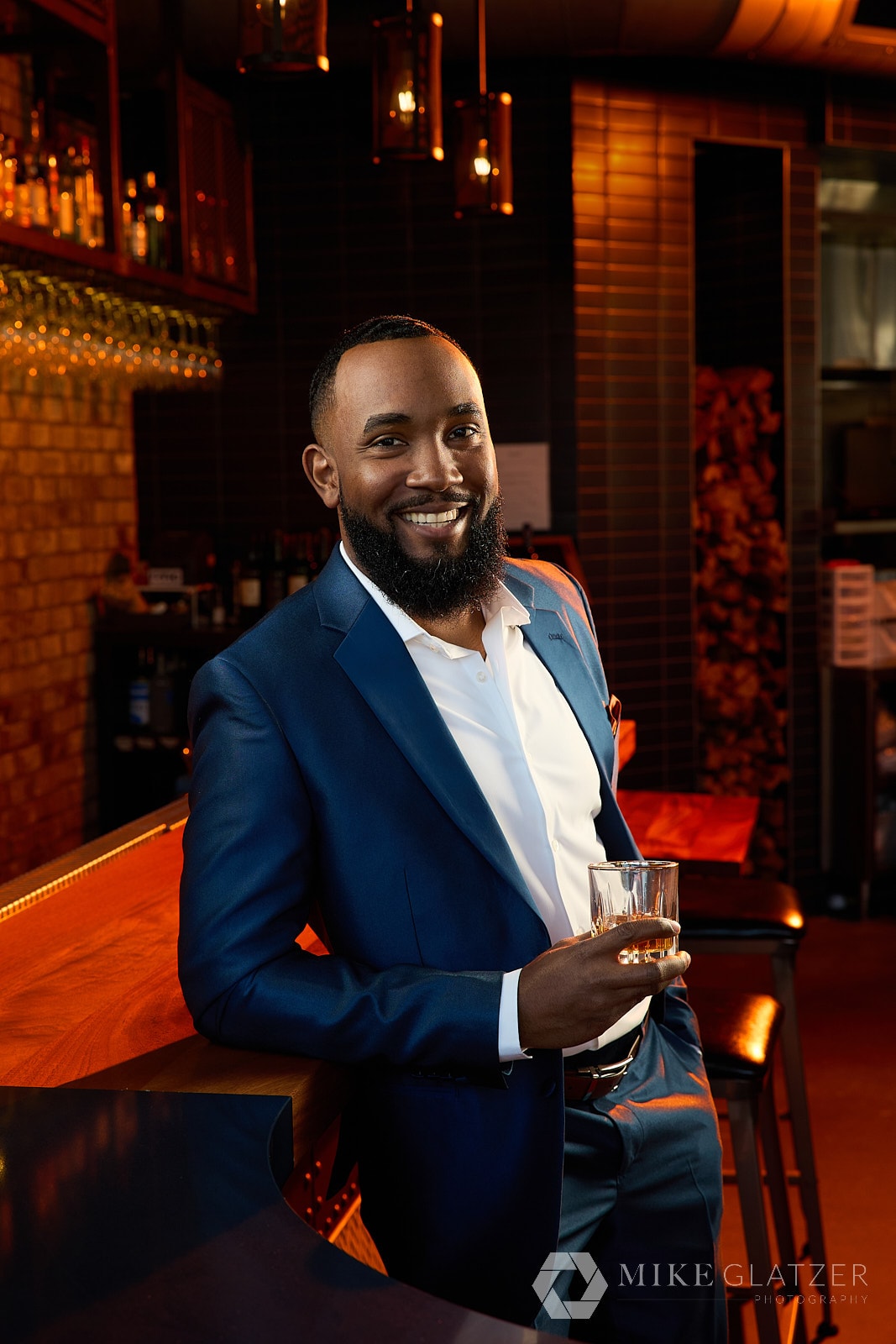
Wearing dark blues says this lawyer is trustworthy and loyal
Colors For Professional Portraits & Headshots
If you need new headshots for LinkedIn or some portraits for the office, the colors you wear can be pretty important. As mentioned above, the choice of colors can influence the way clients perceive you and your personality. So, you’ll want to pick colors that make your audience associate feelings with you that help you earn that job or their business. The best colors to choose are dependent on the industry you’re working in.
Conservative companies and jobs like lawyers & accountants typically wear darker colors. This provides a more grounded feeling of trust, steadiness, and confidence. You can throw in small pops of color to stand out but predominantly stick to darker tones.
For smaller companies and start-ups, it’s almost expected that you wear more casual clothing with brighter colors. These groups are about energy, innovation, and personality.
Finally, you have artists like musicians, painters, authors, etc. There is no standard expectation within this world because clothing and color choices typically reflect the work or personality of the creator. Basically, if you fall into this category, go wild and have fun!
Colors For Actor Headshots
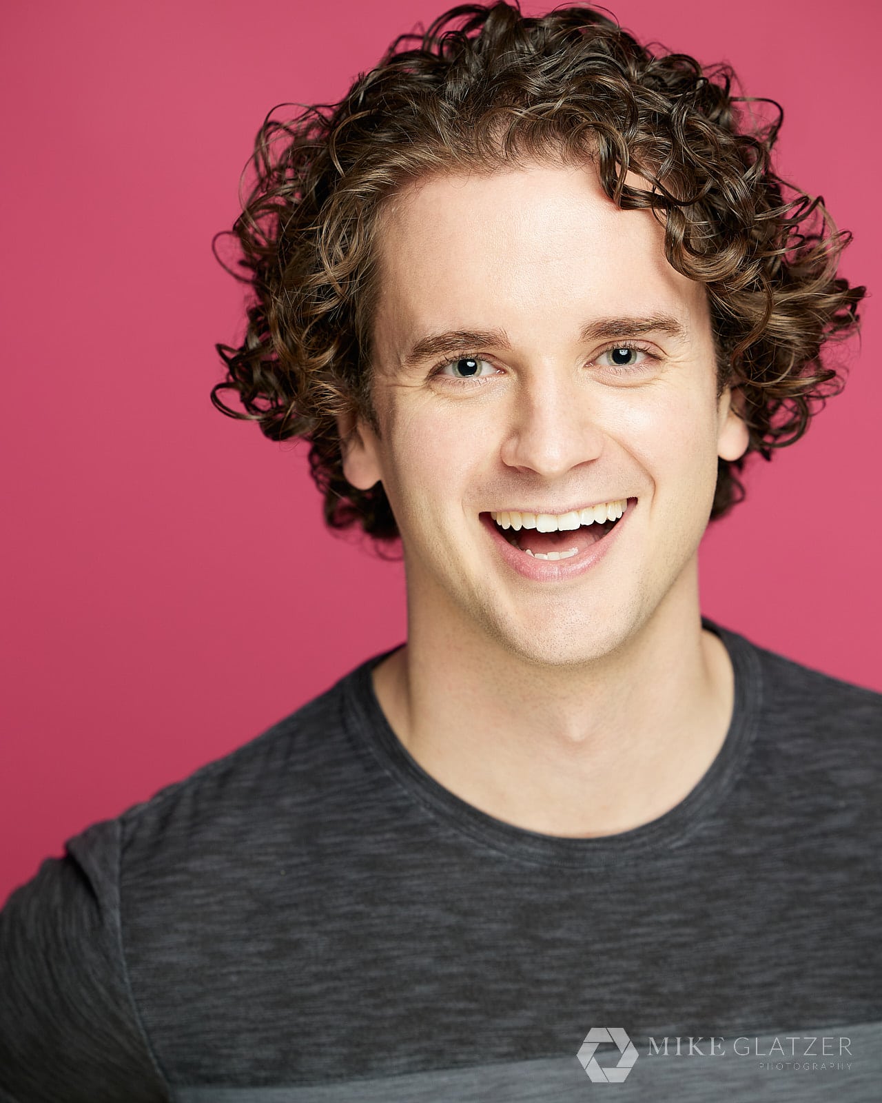
We used a bright background for this fun personality actor headshot
Actor headshots are super fun because you get to wear all kinds of colors. I recommend casual attire for acting headshots because it’s the industry standard. As for colors, you’ll want to do some research into the roles you want to play and pick colors that associate you with those parts in the eyes of casting directors. For example, if you’re going for a bubbly, extroverted high school student, select bright and loud colors. Let’s say you’re going for a lumberjack, outdoorsy role, though; you’ll want to go with warmer, neutral earth tones. To help you figure out what colors to wear for acting headshots, do a Google Image Search for the characters you want to play. Take note of the colors you see, and then use those as inspiration for your own!
Selecting Color Palettes For Portraits
There are three main categories of clothing colors for portraits: warm tones, cool tones, and neutral tones. You typically want to stay within one of these palettes when building an outfit. Mixing too much can be disorienting and mess up that cohesive message you’re trying to send with your images. The other aspect of these color palettes is that your skin tones naturally dictate which of these is best suited for you, specifically. Once you figure out your color palette, picking the best colors to wear for photos becomes easy and can be applied to your everyday wardrobe as well!
Warm Tones
If you have dark brown to dark blonde hair combined with olive skin, you’ll most likely look best in warm tones. Some great colors to wear for photos are oranges, reds, golds, magenta, and turquoise. Most of these are earth-like tones.
Cool Tones
Cool-toned colors work best if your hair is the darkest of a given shade. If you have super dark blond, chestnut, or near-black hair, then colors you should wear include lavender, royal blue, ruby, and emerald green. Cool tones are water tones.
Neutral Tones
Unfortunately, neutral tones require some more trial and error. A good indicator that you would look best with neutrally toned colors is if you have hazel eyes and your hair is also a natural combination of colors. For neutral-toned people, try wearing light pink and other light colors that aren’t super stark or vibrant.
Which Color Palette Should You Wear ?
It may take some trial and error to figure out which color palette you should wear, even with the suggested information above. One trick I’ve found that works really well for cool and warm tones is to look at the underside of your wrist and look at the color of your veins. If your veins are blue, then you should wear cool tones. If they are green, then warm tones are your color palette to wear. There’s no trick for neutral tones, unfortunately, so you’ll have to play around to determine if that works for you.
Pick Colors For Photos To Wear For Seasonal Images
If you’re trying to pick colors to wear for your portraits that match the season or a holiday, then check the below lists! Try to pick colors that fit your color palette for the ultimate color scheme.
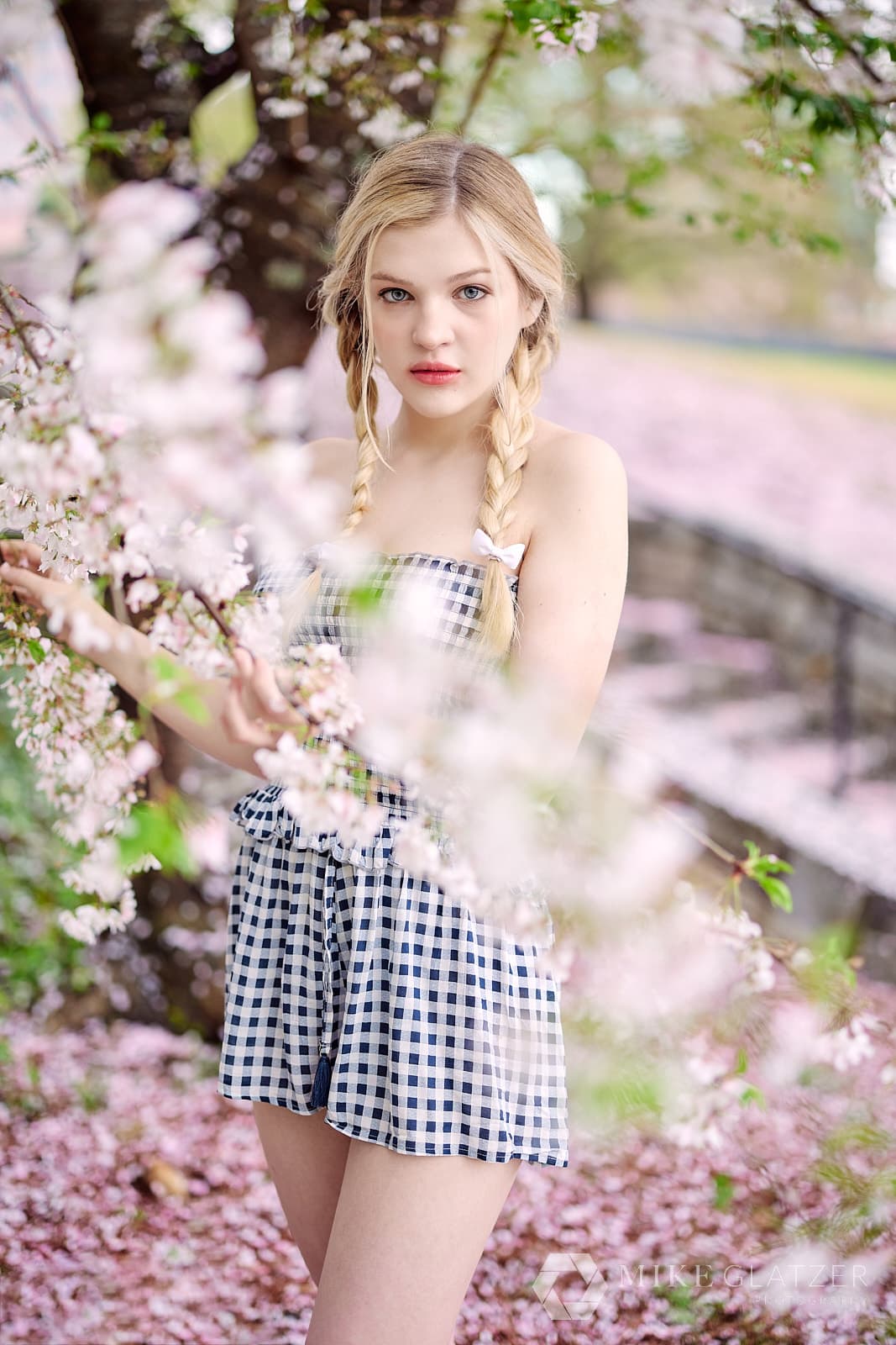
Spring Portrait Colors
Pale pink
Mint green
Baby blue
Cream
Light gray
Soft yellow
Spring green
Lavender
Summer Portrait Colors
White
Yellow
Bold red
Bright orange
Bold pink
Turquoise
Royal blue
Fall Portrait Colors
Browns
Mustard yellow
Burnt orange
Dark shades of green
Dark purple
Neutrals
Winter Portrait Colors
White
Cream
Brown
Black
Medium to dark gray
Ruby red
Dark purple
Emerald green
Blue
Selecting Colors to Wear For Photos Is Tricky
I know we just assembled this awesome list of tips and suggestions for finding the best colors for you to wear for portraits and headshots, but there are some caveats you should consider.
Pale pastels and whites can wash out your skin. Especially if you’re already fair-skinned, the combination of photography strobes and flashes could make those colors blend too much with your skin. Try to balance these with a bolder base makeup color or use a warmer blush.
Stay away from strong patterns, logos, graphics, and accessories. These can all be distracting on camera and pull focus away from you, the subject. These are especially important for headshots! Strong patterns (especially striped or checked shirts) don’t play well with camera sensors. You can an effect called moiré that can make your head hurt to see. Patterns, logos, and graphics make retouching clothes for wrinkles and removing stray hairs almost impossible to do well.
An example of moire
Specifically for headshots, I recommend staying away from sleeveless tops and low necklines. The focus of the image should be on your face. Sleeveless tops can make your shoulders look wider (in a bad way), and also, that flash of skin can be distracting to viewers. I’d also stay away from turtlenecks. Depending on the lighting, you could look like a floating head. Not good.
The easiest thing you can do to ensure you get great photos is to bring options to your session. Bring your favorite colors and other variations. It’s easy to bring more clothes and let your photographer help you figure out which looks the best on camera. This will help make sure you get the best look. Some colors that always flatter no matter what are deep reds, shades in the blue-green family, and grays. I also suggest using complementary colors when layering. You can revisit the section above about color combinations for help here. You can also check out this post about what to bring to your photo session and my guide for how to prepare for your portrait session for additional items to help you look and feel your best for your pictures
First off, age is just a number! I haven’t found any colors that don’t work for a given age range. Maybe more muted colors for more experienced individuals, but it’s ultimately preference. For skin tone, you can get a quick idea by looking at the veins in your wrist. If your veins are blue, then go with cooler color tones. If your veins are green, then go with warmer color tones! If you have more tanned or olive skin, I’d go with warmer color tones. And lastly for hair color, I’d recommend brighter and more vibrant colors for lighter hair shades. All of these are guidelines and not hard-rules as the background of your images and the personality you wish to express will also affect the colors you should wear. I hope this was helpful!
My childrens school photos will have a purple backdrop this year and I was wondering what the best choice of tops would be as to not clash. What would you suggest?
Hey Jayd! A lot depends on your kiddo’s skin and hair colors, but I’d look for complementary colors like greens and yellows. Reds (if it’s not dark like burgundy) can also look really good against purple!
This article is so informative! I wish I had known about the colors and kinds of clothes to wear when having pictures made for myself and my children a long time ago! However, I have it now, and I plan to use the notes I have taken for any pictures I have taken in the future. Thank you!
Hey Betty – I’m so glad you found it helpful! Color psychology is fascinating when it comes to photography and everyday life. I hope you get some awesome images going forward!
Hey Ruth! The same principles apply even to gray hair and fair skin! I think neutral or darker tones will look good to provide contrast and make you pop in the image. You’ve got a lot more flexibility with your hair color in terms of colors, but for fair skin, I’d stay away from off-whites, whites, or super light pastels as you may look washed out. Hope this helps!


any suggestions on how to choose colors based on skin tone, hair color, age, etc?
Hey Laura!
First off, age is just a number! I haven’t found any colors that don’t work for a given age range. Maybe more muted colors for more experienced individuals, but it’s ultimately preference. For skin tone, you can get a quick idea by looking at the veins in your wrist. If your veins are blue, then go with cooler color tones. If your veins are green, then go with warmer color tones! If you have more tanned or olive skin, I’d go with warmer color tones. And lastly for hair color, I’d recommend brighter and more vibrant colors for lighter hair shades. All of these are guidelines and not hard-rules as the background of your images and the personality you wish to express will also affect the colors you should wear. I hope this was helpful!
My childrens school photos will have a purple backdrop this year and I was wondering what the best choice of tops would be as to not clash. What would you suggest?
Hey Jayd! A lot depends on your kiddo’s skin and hair colors, but I’d look for complementary colors like greens and yellows. Reds (if it’s not dark like burgundy) can also look really good against purple!
This article is so informative! I wish I had known about the colors and kinds of clothes to wear when having pictures made for myself and my children a long time ago! However, I have it now, and I plan to use the notes I have taken for any pictures I have taken in the future. Thank you!
Hey Betty – I’m so glad you found it helpful! Color psychology is fascinating when it comes to photography and everyday life. I hope you get some awesome images going forward!
What colors do you recommend for short gray hair and fair skin?
Hey Ruth! The same principles apply even to gray hair and fair skin! I think neutral or darker tones will look good to provide contrast and make you pop in the image. You’ve got a lot more flexibility with your hair color in terms of colors, but for fair skin, I’d stay away from off-whites, whites, or super light pastels as you may look washed out. Hope this helps!